How to Choose Better Card Colors!
How to use a split complementary color scheme to choose card colors that feel bold, balanced, and intentional.
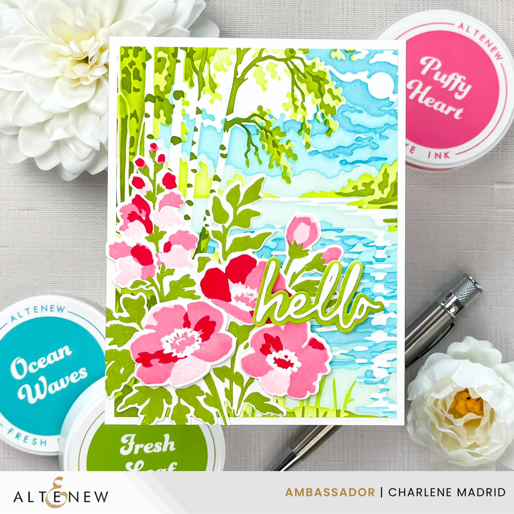
Hi crafty friends! Instead of guessing which colors will work together, I let the color wheel choose the palette for this card. I used the Painterly Perfection Craft Your Life Project Kit from Altenew and built the whole design around pinks, yellow greens, and blue greens for a bright scene that still feels cohesive.
Disclosure
Compensated affiliate links may be used in this post at no cost to you. I received some of the products in this post at no cost. I will ONLY show you products from companies that I believe in and purchase from personally. Thank you for supporting me so that I can continue to bring you lots of fun crafting content!
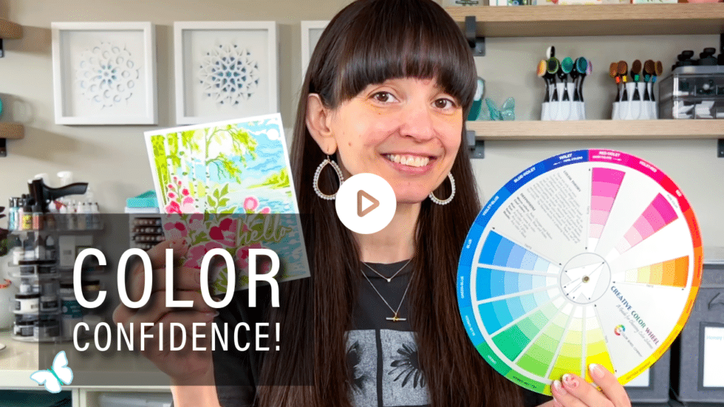
Watch the full video tutorial on YouTube
Click here for the full supply list
In the video, you’ll learn:
- How to use a split complementary color scheme for cardmaking
- How to build a scene with yellow greens and blue greens
- Why pink florals pop against cool scenic backgrounds
- A simple flashlight trick for lining up layering stamps
- How to repeat colors in your sentiment so everything ties together
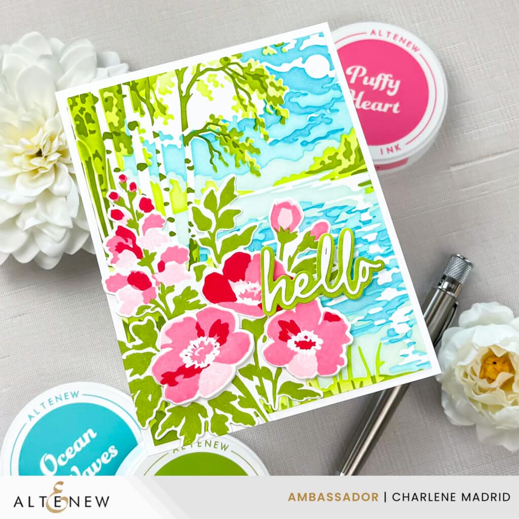
I love how this card turned out because the colors look bold, but they are not random. A split complementary color scheme gives you a simple roadmap, and once you have that, every color choice feels easier. Try picking one main color, finding the two split complements, and using that trio as the starting point for your next card. If you do, leave me a comment and tell me which combo you used, or tag me @dreamcraftcreate so I can cheer you on and share your project.
Happy crafting!
Charlene
Supplies