5 Tricks to Make Die Cuts Look More Realistic
Learn five simple ways to make paper die cuts look more realistic by thinking about materials, texture, shadows, transparency, and shine.
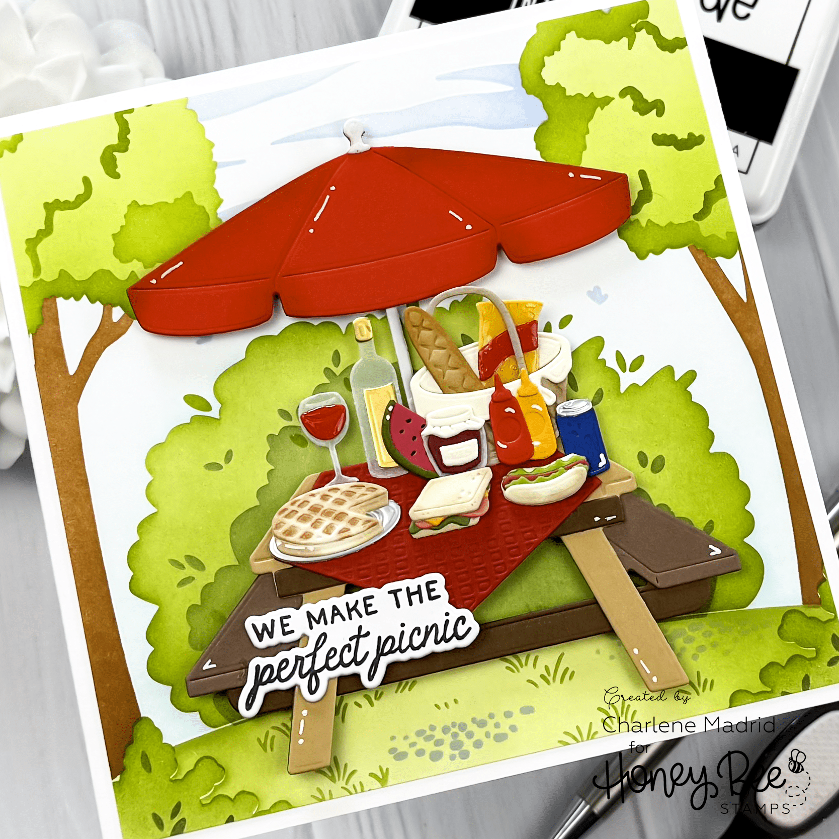
Hi crafty friends! Have you ever looked at your card and thought, “This still looks like paper”? For this project, I used the Lovely Layers: Picnic Table dies from Honey Bee Stamps to build a full picnic scene and show how a few small details can make die cuts feel much more lifelike.
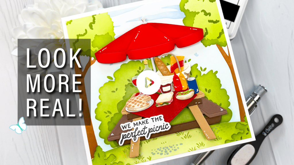
Watch the full video tutorial on YouTube
Click here for the full supply list
Disclosure
Compensated affiliate links may be used in this post at no cost to you. I received some of the products in this post at no cost. I will ONLY show you products from companies that I believe in and purchase from personally. Thank you for supporting me so that I can continue to bring you lots of fun crafting content!
In the video, you’ll learn:
- How to choose cardstock colors that match the material you are creating
- How to use vellum for glass, bottles, and jars
- How to add texture with alcohol markers
- How soft ink blending creates realistic shadows
- How selective shine makes die cuts feel finished

The next time you are building a die cut scene, stop thinking about cardstock first and start thinking about materials. Is it wood, glass, wicker, fabric, or food? Once you answer that, choosing the right colors, texture, shadows, and finishes becomes so much easier.
Which realism trick do you use most often, ink blending, texture, vellum, or shine?
Happy crafting!
Charlene
Supplies