
Pinkfresh Studio “The Couture Edit” Release Blog Hop
Hi crafty friends! Today I’m sharing two card projects featuring the brand new Couture Edit Release from Pinkfresh Studio, and yes, this collection is every bit as fun as it sounds. Both cards were created with the coordinating stamp, die, and stencil combos, which means you get that crisp stamped detail plus smooth, no-stress ink blending for the color layers.
I’m also joining a Pinkfresh Studio blog hop, so be sure to scroll down for giveaway details and hop info.
Disclosure
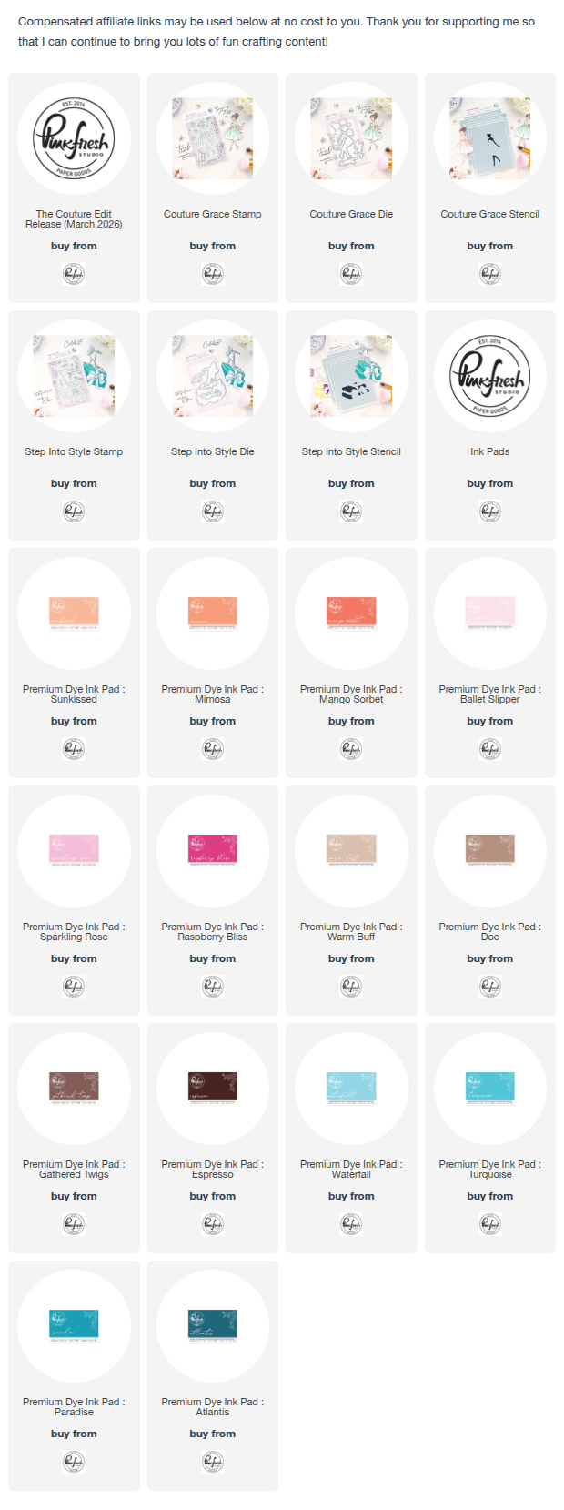
Compensated affiliate links may be used in this post at no cost to you. I received the products featured in this post at no cost as a Pinkfresh Studio guest designer. I will ONLY show you products from companies that I believe in and purchase from personally. Thank you for supporting me so that I can continue to bring you lots of fun crafting content!
Card One: Couture Grace

For my first card, I used the Couture Grace stamp, die, and stencil to create a bright, polished focal image with a soft ink blended background. I started by stamping the image in a crisp black ink, then used the coordinating stencils to add all of the color. This is one of my favorite ways to color because the shading builds so quickly and still looks smooth and professional.
For the dress, I blended Sunkissed, Mango Sorbet, and Raspberry Bliss, keeping the lightest shade toward the highlights and deepening the color in the folds and shadow areas. The ribbon was stenciled with Ballet Slipper, Sparkling Rose, and Raspberry Bliss to coordinate with the dress while still standing out. For the shoes, I used Ballet Slipper and Sparkling Rose to keep them soft and feminine.
I added quick color to the rest of the image using the remaining stencils. The flowers were blended with Ballet Slipper, Raspberry Bliss, and a touch of Gathered Twigs for definition. For the skin tones, I used Warm Buff and Doe, and for the hair I blended Gathered Twigs and Espresso.

Once everything was stenciled, I used the matching die to cut the image out with a perfect border. I ink blended a soft aqua halo behind her on a white panel (keeping the edges lighter so the focal image really pops), then adhered the image with foam tape for dimension. I finished the card with a few stenciled florals around the focal point and added the sentiment “The world needs your sparkle” across the dress. That sentiment placement feels so fun and modern, and it keeps the design clean without needing extra layers.
Card Two: Step Into Style

For my second card, I used the Step Into Style stamp, die, and stencil to create a bold fashion moment with bright stacked boxes, a big bow, and that gorgeous high heel. I started the same way by stamping the image in black, then used the coordinating stencils to color everything in.
For the boxes, I blended Sunkissed, Mimosa, and Mango Sorbet, which gives the stack that warm, golden glow. I kept the darkest color along the edges and corners to make the boxes look more dimensional. For the bow and butterfly, I used Ballet Slipper, Sparkling Rose, and Raspberry Bliss, adding the deepest shade right where the ribbon tucks and folds for that extra pop.
The shoe was my favorite part to stencil. I blended Waterfall, Turquoise, Paradise, and Atlantis to create a rich teal gradient, concentrating the darker shades under the straps and along the heel. That cool teal against the warm orange boxes is such a satisfying contrast, and it instantly gives the card a bright, editorial look.

To tie everything together, I added a soft blue ink blended background, keeping the color most intense behind the image and fading it outward. Once the background was finished, I die cut the focal image and popped it up with foam tape. I tucked the sentiment “Celebrate in style” over the top, keeping the placement slightly off center so you still see the full shape of the shoe and the box stack.
Pinkfresh Studio Blog Hop + Giveaways
This post is part of the Pinkfresh Studio Couture Edit Release Blog Hop, and there is so much inspiration happening along the way. Be sure to hop along and leave comments because there are some amazing giveaways up for grabs.
Giveaways:
- Pinkfresh Studio is giving away the full release on the Pinkfresh Studio blog and YouTube channel.
- Pinkfresh Studio is also giving away TEN $50 gift cards along the hop. Winners will be randomly selected from the comments on the hop posts.
Winners will be posted on March 12, 2026, on the Pinkfresh Studio Giveaway Page. Be sure to check that page and claim your prize within two weeks if you are a winner.
Hop List
You can find the full hop list here.
If you arrived from Rachel’s blog, you are in the right place.
Your next stop is Karin’s blog.
Thank you so much for stopping by today. If you recreate either of these projects, I would love to see what you make. Tag me on Instagram @dreamcraftcreate so I can cheer you on.
Happy hopping and happy crafting!
Charlene
Supplies
love those cards with these vibrant colors!!
Oh this set is sooo cute! The first card is perfect with the blue background to highlight the girl. The second card images capture the sentiment so well!
Great cards! The colors are so bright and cheerful and your shading is spectacular!
Love the cards – and you do such a great job with the coloring!
Love the cards – and you do such a great job with the coloring! I am impressed because I struggle with that.
Your shading, with multiple colors, is so pretty. It’s a spunky, yet classic dress.
Charlene!! I love your Couture girly! She is très sophistiquéé! And honestly, I know it’s technically a background detail, but I am always impressed by how you manage to get the subtle color shaded background just where it needs to go to fit around your images and give the impression of a scene without overwhelming the focal points. Beautiful work, as always!
Love the orange tones you used, they really pop with all the blue! Lovely cards.
Beautiful cards. Love how you used the same colors
Your cards are just gorgeous! Love the colors you used. TFS.
Very sweet cards; colors add to their beauty.
Love your colour palette! The cards are so pretty and vibrant! I love the Pinkfresh colours and will miss them when my re-inkers are empty. I hope the new colours are as brilliant as the current ones! Thank you so much for the inspiration. Will try your colour combos!
Love your colour palette! The cards are so pretty and vibrant! Thank you so much for the inspiration. Will try your colour combos!
These are so lovely! I love the soft ink blending behind the focal images, it really ties the whole card design together!
I love the colors!
She is stunning! I LOVE your coloring! Beautiful designs!
Beautiful cards, I like the color palette!
The use of the blue ink behind the girl is a fabulous idea. It really does enhance the card..
This card is so pretty. I love the design and the colors!
i love the blue background behind the girl in Couture Grace! so stunning! 🙂
These are gorgeous! I love blues and oranges together.
Your colour choices and the blending are amazing!!
I love your cards especially the colors you used. They scream Spring and I can’t wait for the warmer weather. Thank you for inspiring me.
Love the cards. Love the vibrant colors.
Both cards are gorgeous, love the colors! She is glorious!!!
Beyond gorgeous. That teal background really makes the orange hues pop
I was so happy that someone highlighted this wonderful little lady. It reminds me of how my older sisters dressed up. She is wonderful and you did a beautiful job! The second card is really sweet. I just don’t wear those high heels any more ….. TFS
Charlene, I love both your cards. My favorite is the Stepping Into Style!
WOW! It’s gorgeous!!!
Love your colors!
These are beautiful cards. This girl is so feminine and dainty, but I love them both
Your cards are both adorable! I really enjoyed checking them out!
Love the colors. Gorgeous cards. I love the Couture Grace.
I love the light blue and orange/pink pairing! That first card – the girl in a bright dress seeming to float in air with flowers drifting around her – magical.
The oranges are beautiful!!!
Your cards are beautiful
Love your color choices. Beautiful cards
Nice ink blending on your cards! Makes them look flawless! Your cards are beautiful!
Pretty cards with nice ink blending and choice of colors.
Exquisite coloring and blending.
Both cards are fabulous!
Lovely cards. Beautiful ink blending.
Beautiful colors 💜
Beautiful cards, the shoe is one of my favorites!!
I love these bold colors together! So pretty!
Cute cards and lovely coloring!
Beautiful designs and color combos! Love the fabulous cards you created!
Beautiful takes, love the color!
Loving the vibrant colours 😍
Wonderful cards love how the blue background allows the images to stand out.
Ooh La La!! So pretty!
Your blended backgrounds are perfect for your images. Not overwhelming-just enough to let your images stand out. These would be wonderful cards to give to a young lady on her first prom night.
Gorgeous cards! Love the colors.
Very pretty card!!
Wow! These are so beautiful. I love the coloring you did and the vibrant colors you used.