Always There Card Ideas with Simon Says Stamp
Three bright and heartfelt cards featuring clean layers, bold color, and easy ways to add texture and sparkle.
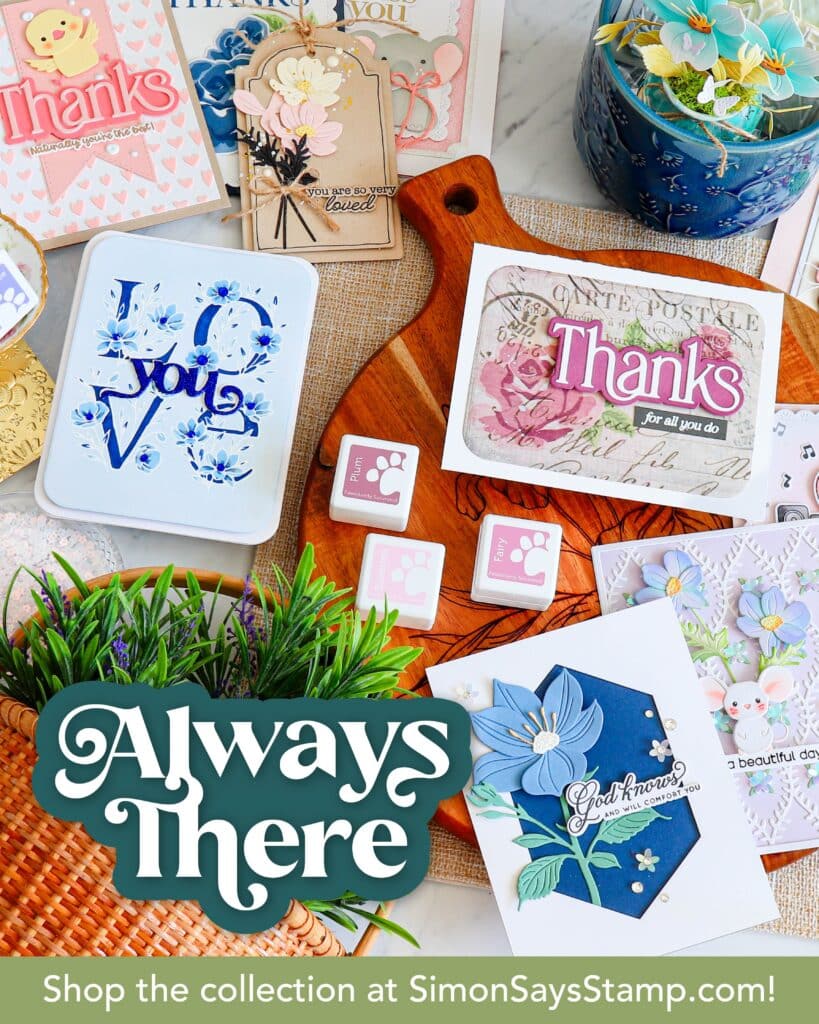
Hi crafty friends! Today I’m sharing three cards featuring the new Always There release from Simon Says Stamp. I leaned into bright ink blending, clean white space, and a few high-impact details (like a peekaboo shaker and a bold embossed sentiment) to create cards that feel fun, modern, and totally doable.
For the full supply list, click here or scroll down to the thumbnails at the end of this post.
Disclosure
Compensated affiliate links may be used in this post at no cost to you. I received the products featured in this post at no cost as part of the Simon Says Stamp designer family. I will ONLY show you products from companies that I believe in and purchase from personally. Thank you for supporting me so that I can continue to bring you lots of fun crafting content!
Card One: Rainbow Lattice Shaker
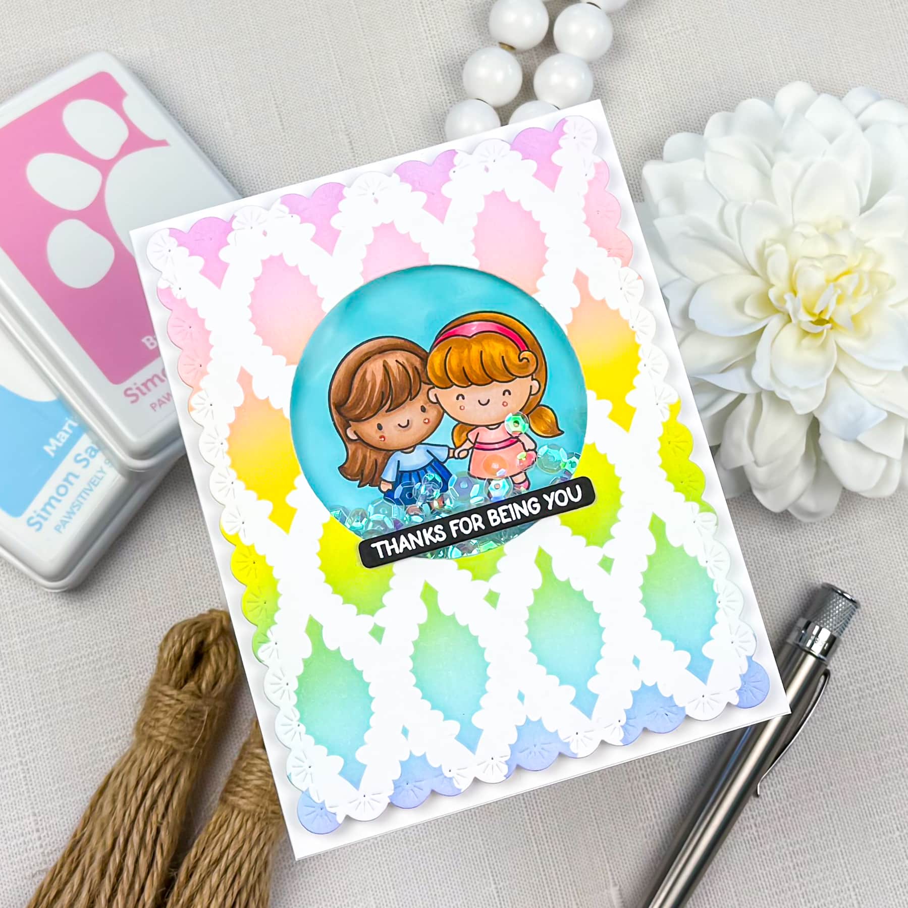
This first card is all about color + texture, with a fun little shaker moment right in the center. I started with the Willowweave Stencil and ink blended a rainbow blend across the background, keeping the transitions soft so the colors feel smooth and airy. Once the ink blending was done, I die cut a large circle window from the center.
To add detail I die cut the panel using the Sparkler Scallop Frame Dies. The scalloped border instantly creates interest! I backed the circle opening with acetate, added foam tape around the window, poured in a iridescent sequins, and sealed it up with a second piece of cardstock behind the panel.
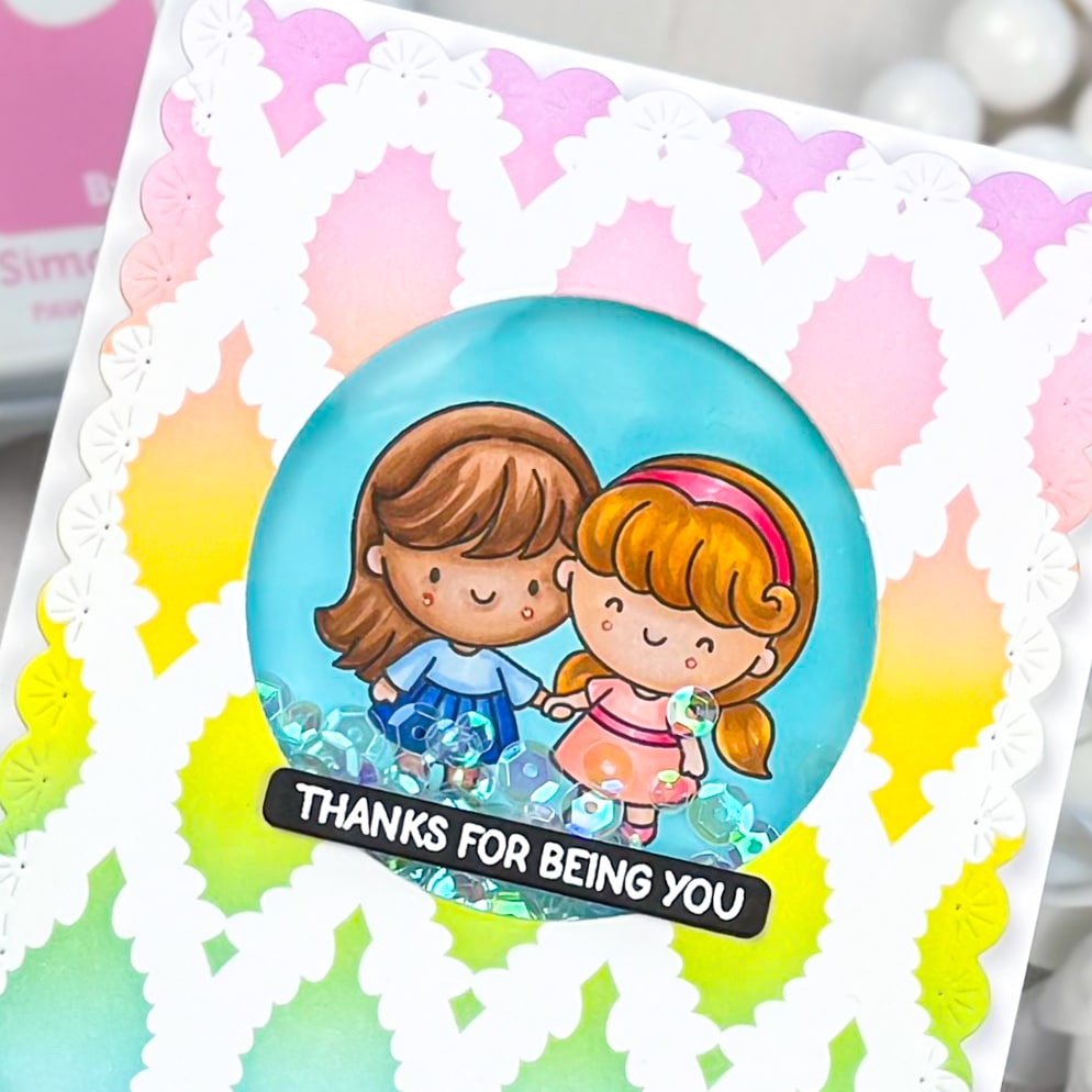
For the focal point, I stamped and colored the Best Sister Stamps inside the shaker window, then finished the card with a bold sentiment strip. This layout is such a good one to keep in your back pocket because you can swap the colors and sentiment and use it for so many occasions.
Card Two: Clean Embossed Florals
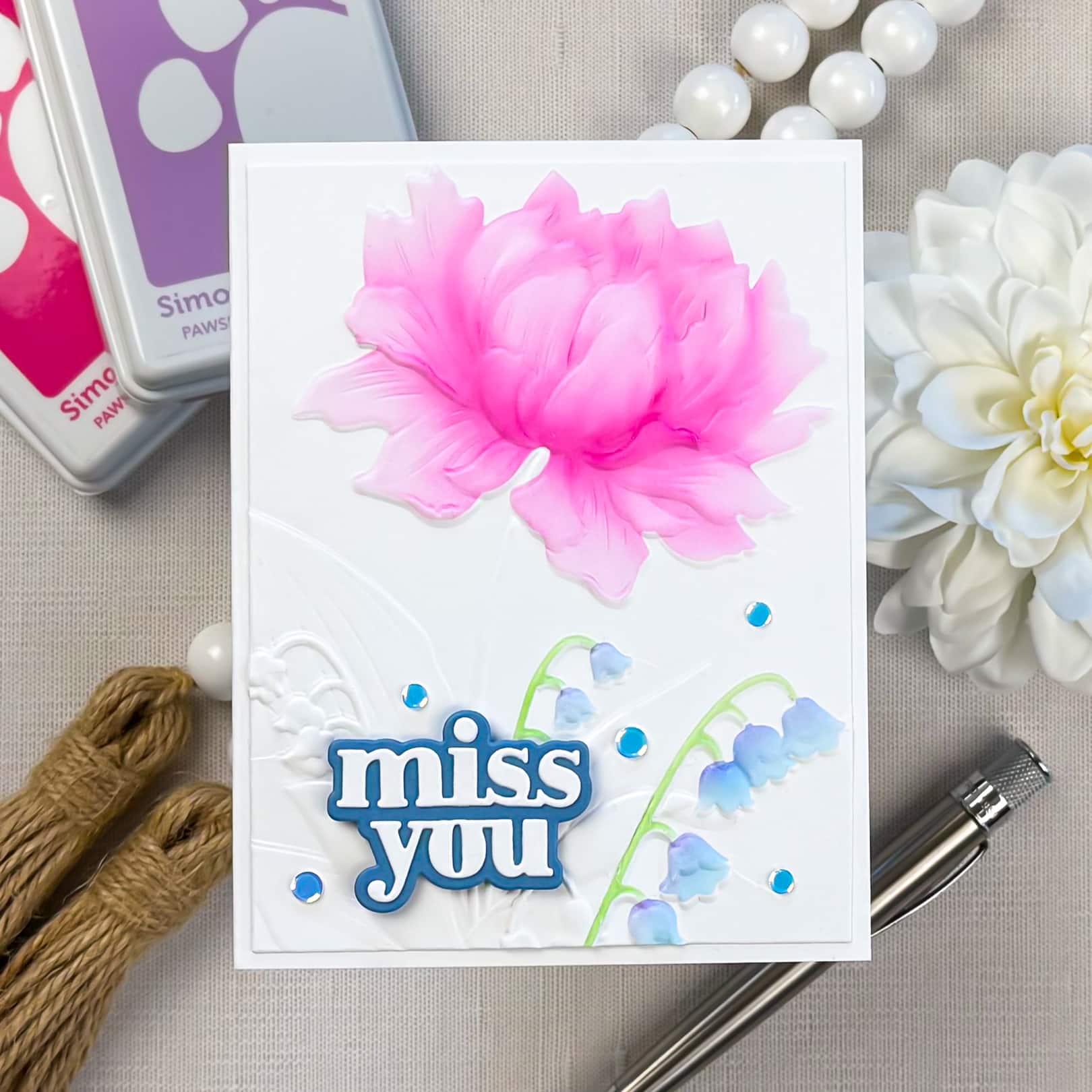
For the second card, I wanted something soft and elegant with lots of white space. I started with a white panel and added subtle texture using the Peony and Bells Embossing Folder, keeping the background tone-on-tone so the focal elements stand out.
The star of this card is the oversized peony. I used the coordinating dies to create masks with Masking Magic. Then I ink blended the petals in a pink ombré blend, keeping the deepest color toward the center and fading out to a lighter pink on the outer edges. Even with a simple color palette, that shading makes the flower feel dimensional and polished. I added a few delicate stems in soft blue tones to balance the composition and bring the eye down to the sentiment.
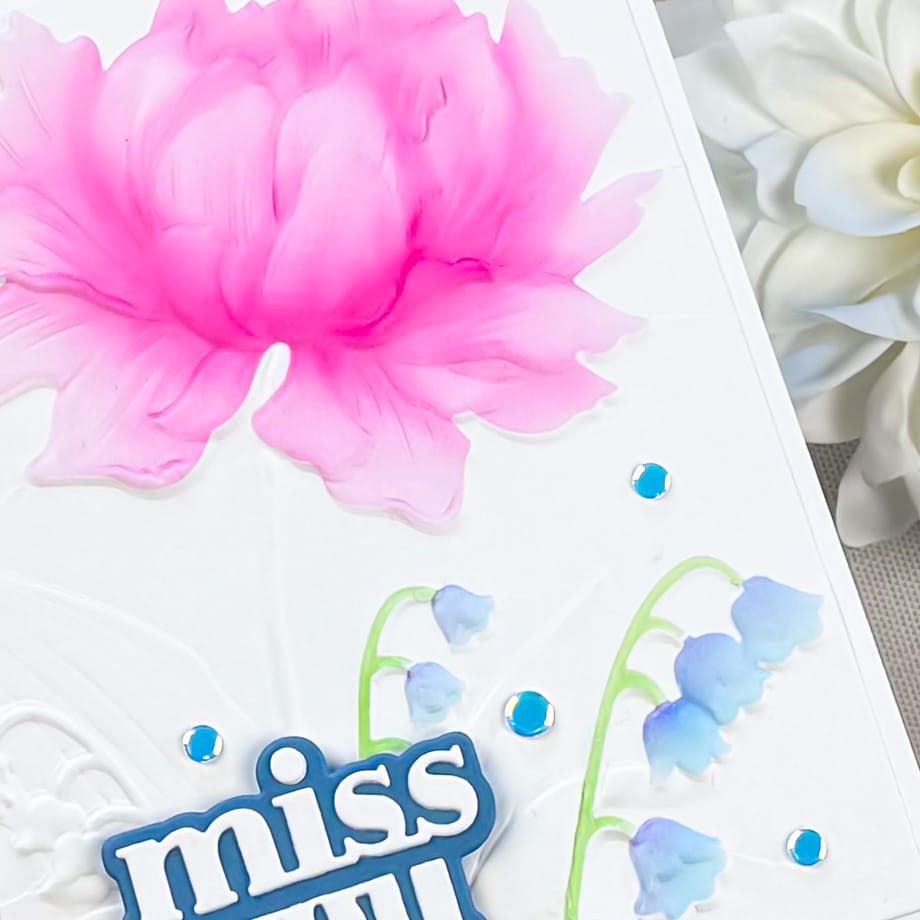
The Miss You sentiment is layered for dimension (a quick detail that always makes a card feel more finished), and I scattered a few pieces of iridescent confetti around the bottom area to add just the right amount of sparkle without cluttering the design.
Card Three: Bold Floral on Navy + White Embossed Sentiment
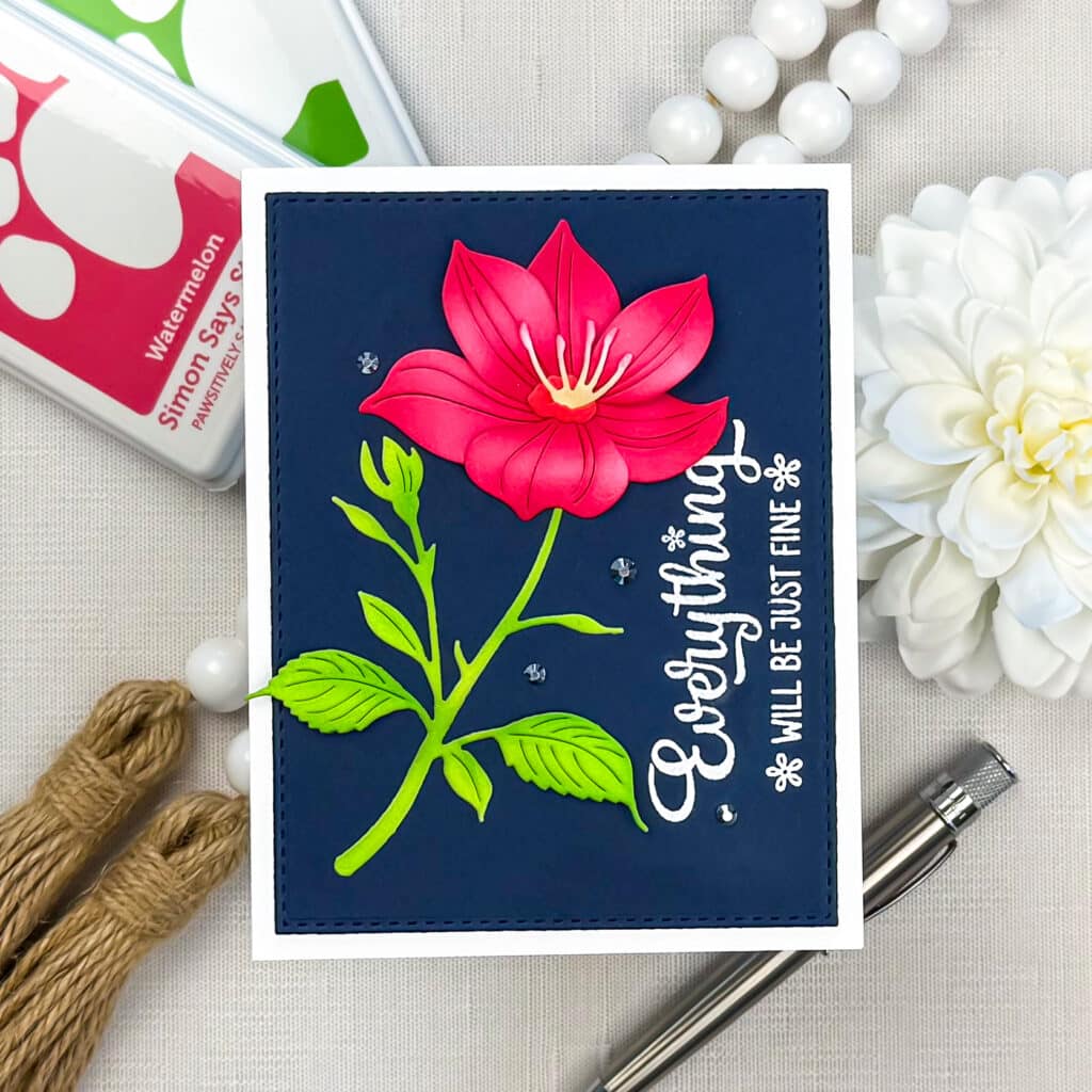
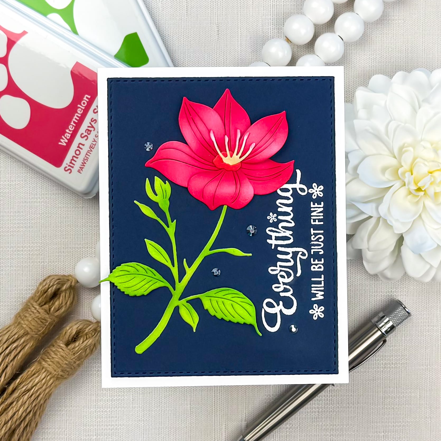
This last card is a great example of how dramatic a project can feel with a simple color palette. I started with a deep navy panel (stitched edges for a clean finish), then added the Luna Flower built from ink blended die cuts in rich pink and red tones. I kept the shading darkest at the base and lighter toward the center of the petal for a realistic look.
For the greenery, I ink blended using bright greens to create a strong contrast against the navy background. That crisp pop of green makes the flower feel even brighter and keeps the design from feeling too heavy.
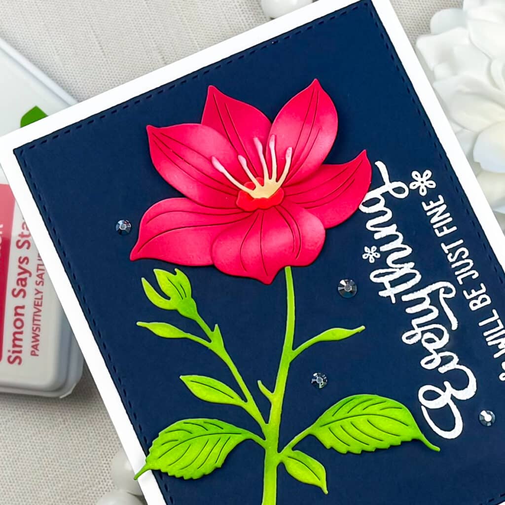
To finish the card, I heat embossed a Frankly, My Dear sentiment in white. The mix of a bold floral focal point with clean typography is one of my favorite looks, and it works beautifully for encouragement cards, thinking of you cards, or anytime someone needs a little lift.
If you give either of these ideas a try, I would love to see what you create. Tag me on Instagram @dreamcraftcreate so I can cheer you on.
Happy crafting!
Charlene
Supplies