Easy Tricks for Amazing Contrast!
Two simple ways to make layered florals look bolder and more finished with just a few small contrast tweaks.
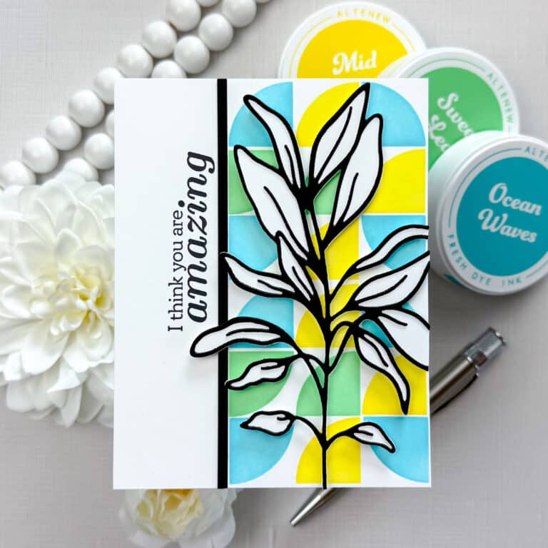
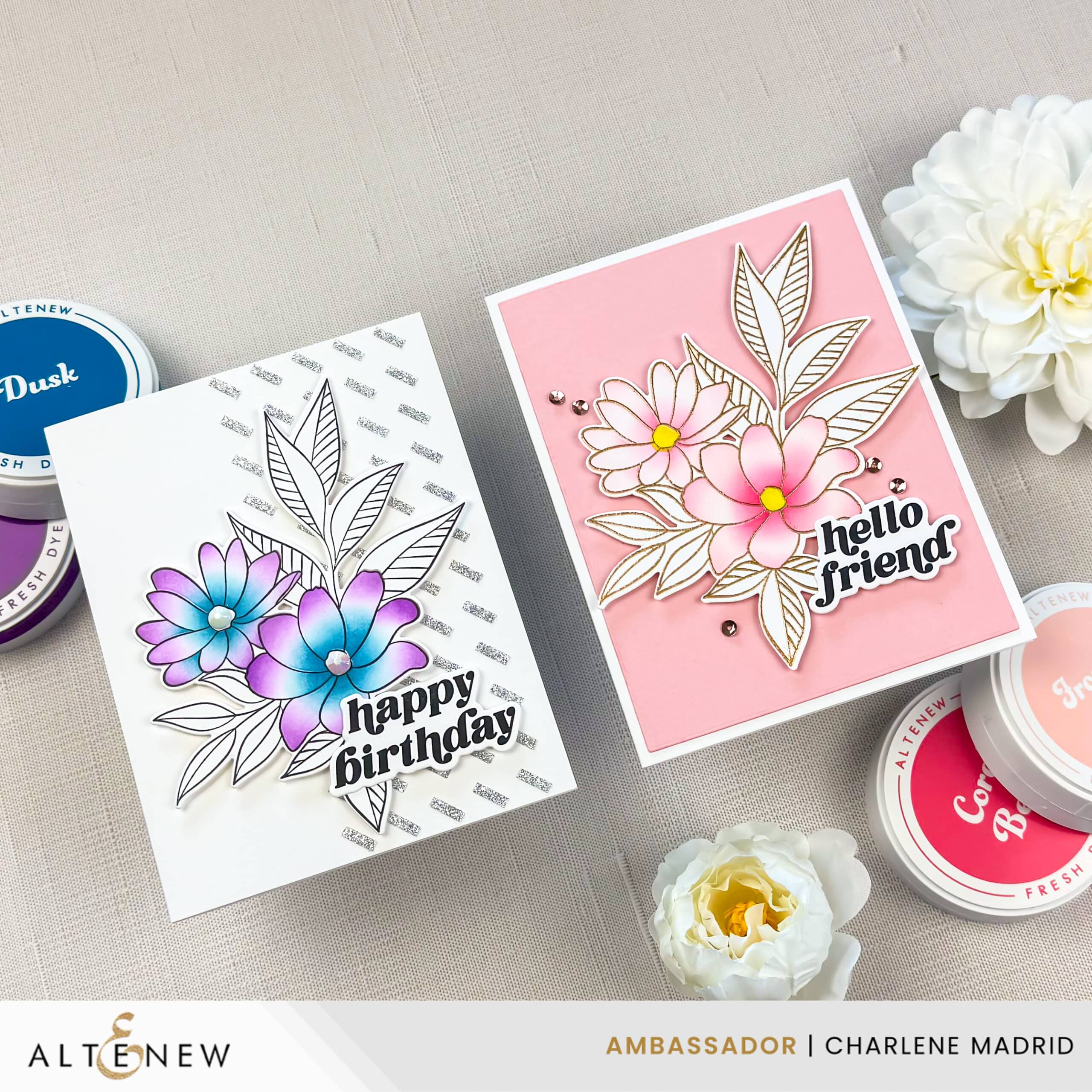
If your floral cards ever feel a little flat, contrast is the fastest way to fix it. In this live replay, I use the Sweet Bouquet Bundle from Altenew to create two different looks that come together quickly, but still feel high impact.
Disclosure
Compensated affiliate links may be used in this post at no cost to you. I received some of the products in this post at no cost. I will ONLY show you products from companies that I believe in and purchase from personally. Thank you for supporting me so that I can continue to bring you lots of fun crafting content!
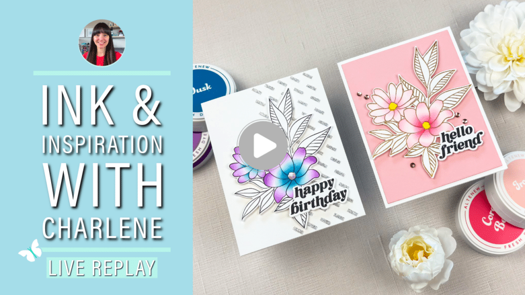
Watch the live replay on YouTube
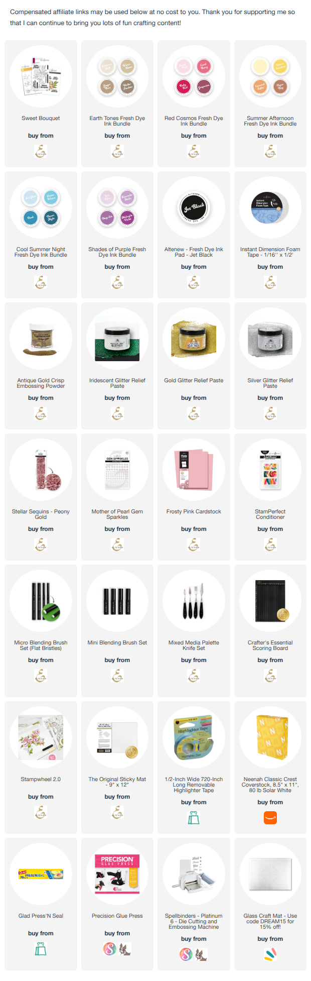
Click here for the full supply list
In the live, you’ll learn:
- How to create contrast using ink intensity, even when you use the same color family
- How to use a mini brush plus a micro brush to add fast shading where it matters
- Why a light brown “stencil stamp” is perfect when you plan to emboss details later
- How to layer metallic embossing with soft ink blending for instant wow
Exclusive Limited-Time Offer
Altenew shared a special discount for my viewers on the Sweet Bouquet Complete Bundle.
- 35% off with code: CHARLENESWEET
- Valid: June 10, 2026 at 12:00AM EDT through June 12, 2026 at 11:59PM EDT
- Shop with the code here
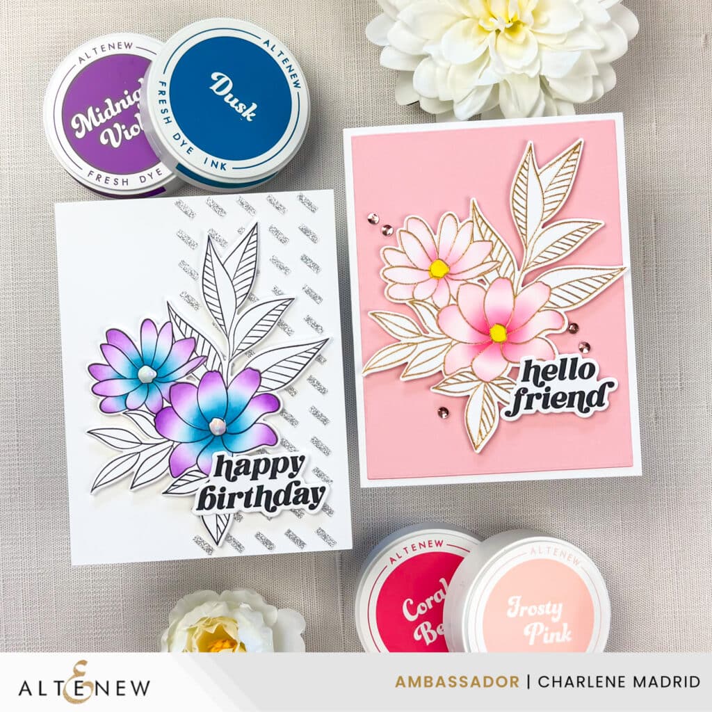
I love how both looks turned out because they prove you do not need complicated coloring to get a card that feels finished. A little shading, one bold contrast choice, and one sparkle element goes a long way. If you try either of these Sweet Bouquet looks, leave me a comment and tell me which combo you used, or tag me @dreamcraftcreate so I can cheer you on and share your project.
Happy crafting!
Charlene
Supplies