How to Watercolor Lemons with Life & Zest – A Fresh Take with Altenew
Exploring Watercolor Techniques from Altenew Academy
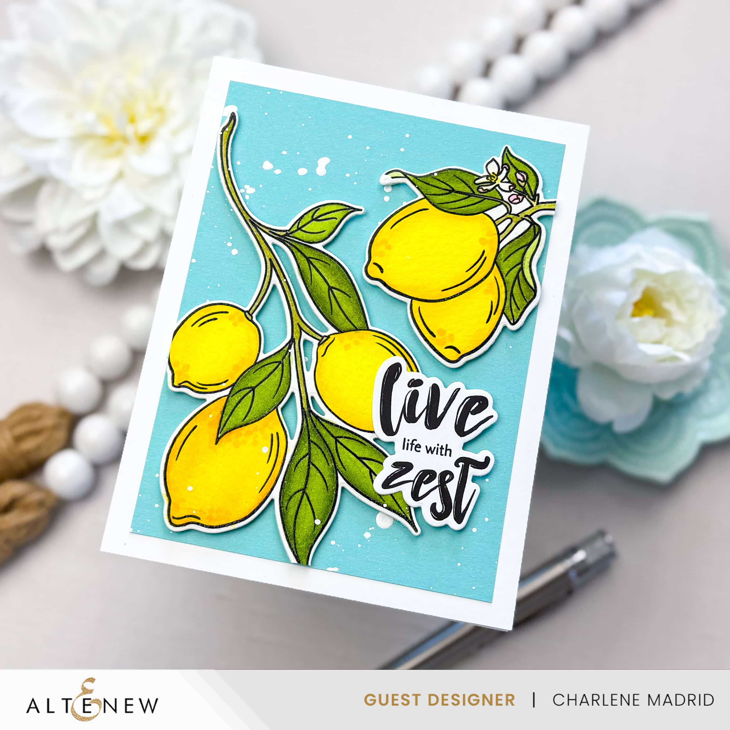
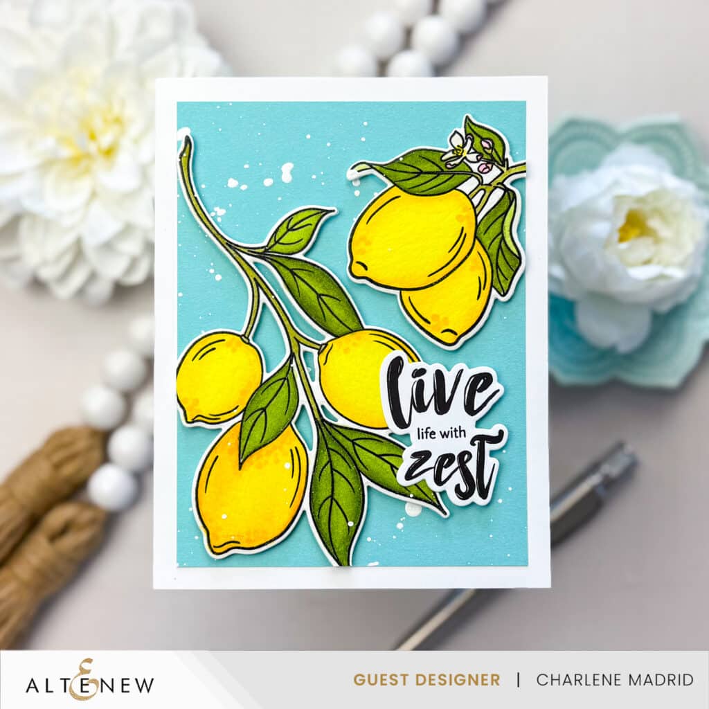
Hey crafty friends! I’m thrilled to share my latest creation for the Altenew Educator Certification Program. This card was inspired by the techniques I learned in the Artist Watercolor 101 class, and I had a blast bringing it to life using Altenew’s Zesty Life stamps and dies.
Disclosure
Compensated affiliate links may be used in this post at no cost to you. I received some of the products in this post at no cost. I will ONLY show you products from companies that I believe in and purchase from personally. Thank you for supporting me so that I can continue to bring you lots of fun crafting content!
Crafting the Card
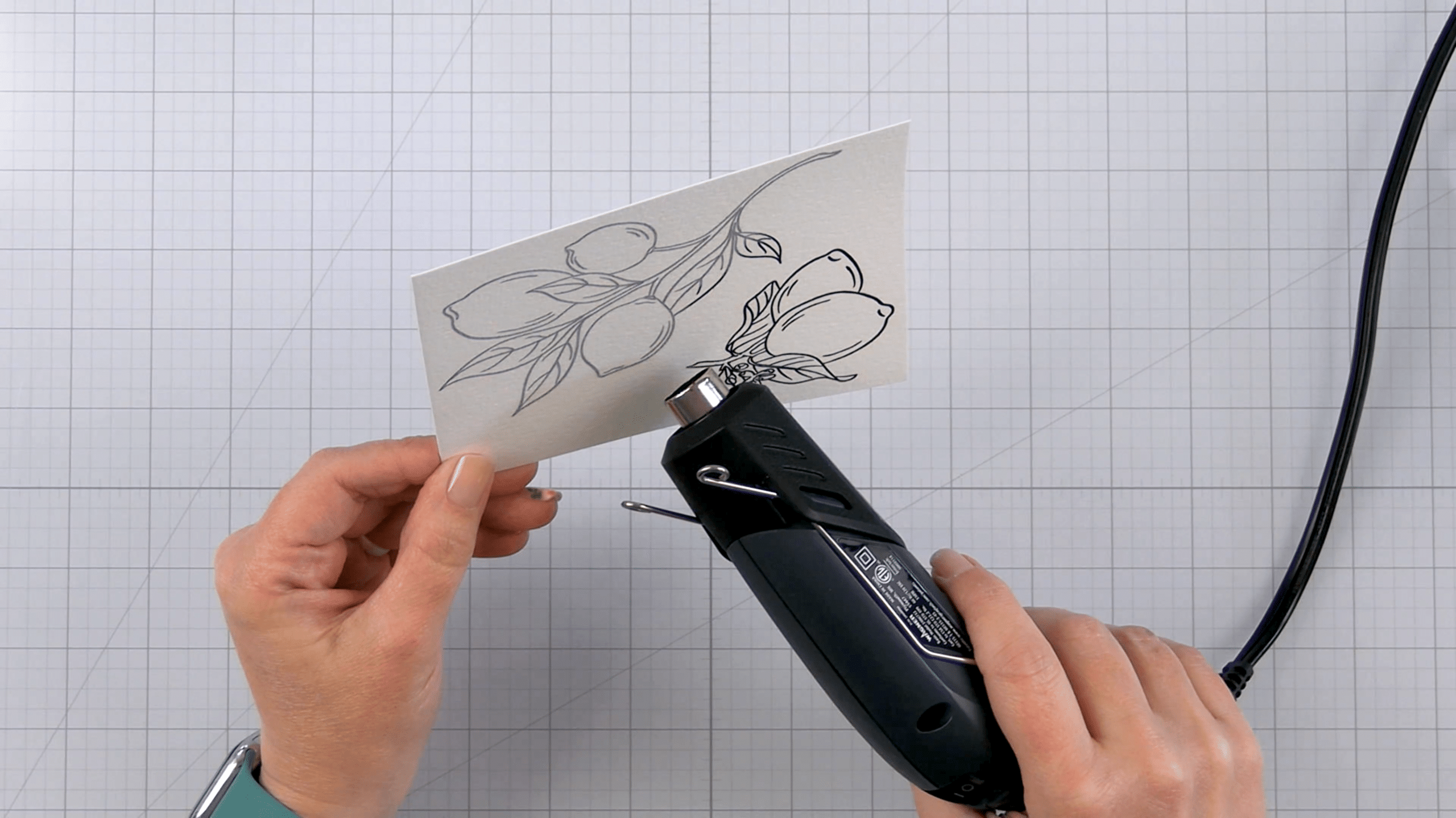
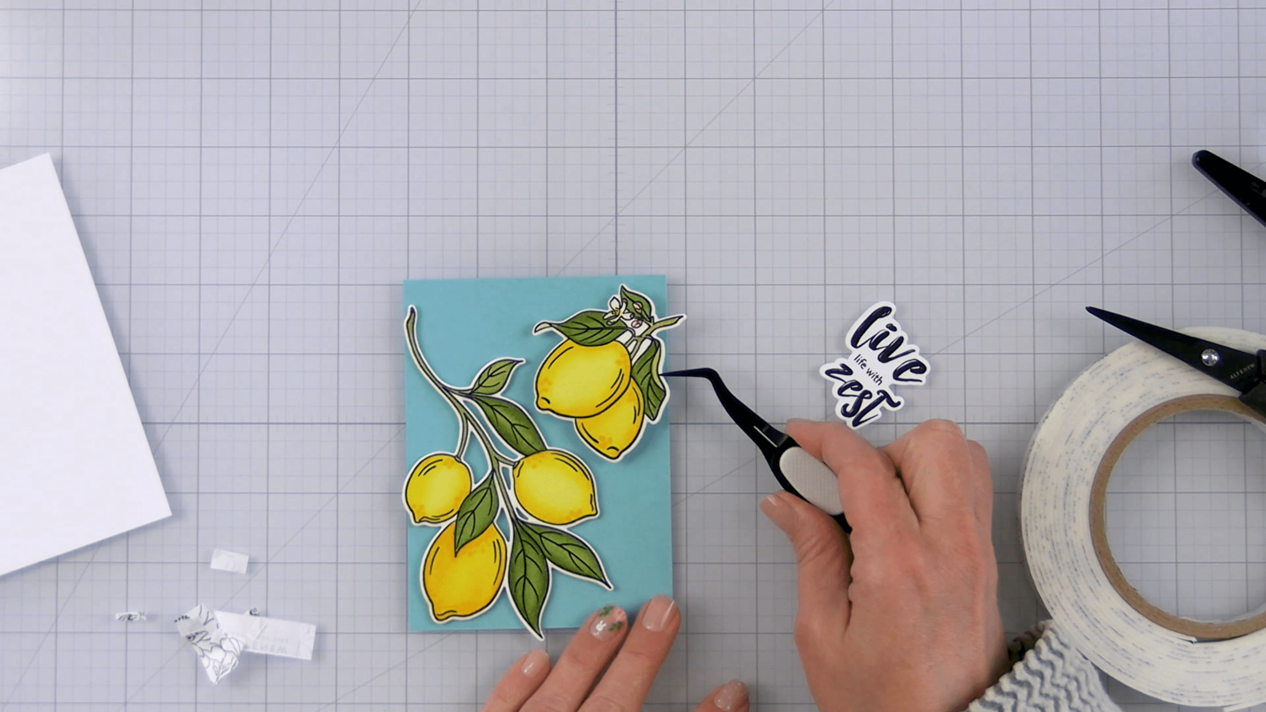
I began by stamping the lemon and leaf images from the Zesty Life stamps onto cold-pressed watercolor paper using pigment ink. To ensure crisp lines and prevent the watercolor from bleeding, I heat embossed the images with clear embossing powder.
For the lemons, I worked in layers, starting each color at the outer edges and gradually working toward the center. I first applied a soft yellow base, followed by a slightly darker yellow, and finished with a vibrant orange-red to add warmth and contrast. I used my heat tool to dry between layers, allowing each new color to build on the one before it without blending away the depth.
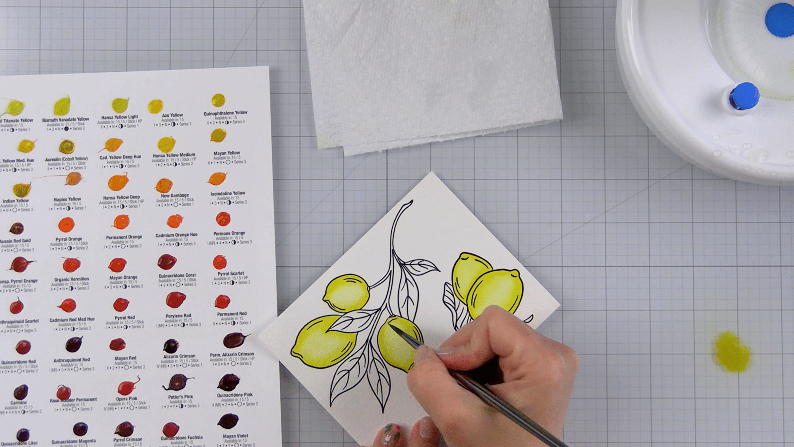
For the leaves, I chose a medium green that diluted beautifully into a soft olive tone. This simple transition gave the leaves subtle dimension and a more lifelike appearance.
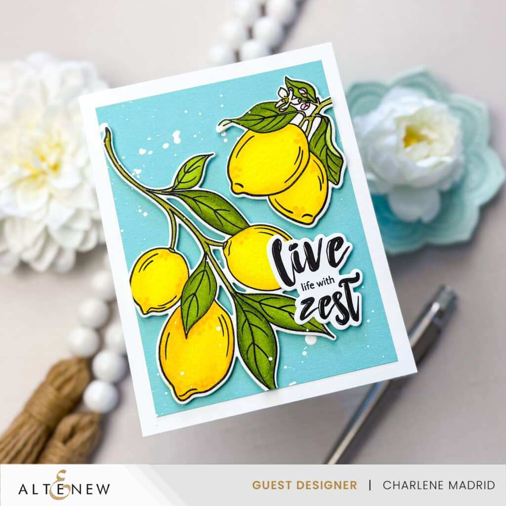
Once the watercoloring was complete and the images were dry, I used the coordinating dies to cut them out. To add extra dimension, I adhered the die-cut images to a Sea Glass cardstock panel using Instant Dimension Foam Tape.
I chose Sea Glass for the background because of the way it plays off the warm yellow tones of the lemons. Using basic color theory, yellow and blue-green sit opposite each other on the color wheel, creating a natural sense of contrast and harmony. The cool background helps the citrus hues pop, making the entire composition feel bright and balanced.
To enhance the texture and interest, I added a few dots to the lemons using alcohol markers. Finally, I splattered the entire card with white acrylic paint to give it a fresh, zesty feel.
Tip: Don’t Overthink the Color
One of the best parts about watercolor is how beautifully unpredictable it can be. When painting the lemons, I varied the amount of each color I used. Instead of trying to make every lemon “perfect,” I embraced the variation. That little bit of looseness adds charm and life to the final piece!
I hope this card inspires you to explore watercolor techniques in your own projects. The Zesty Life set is perfect for experimenting with color blending and dimension. Happy crafting!
Supplies


LOVE LOVE LOVE, and I loved it when you said not to overthink it. People do tend to overthink when it comes to watercolor, and I think that is one of the biggest obstacles.