5 Design Tricks for Better Die Cut Scene Cards
I’m sharing five simple design principles that make die cut scene cards feel more dimensional, balanced, and polished.
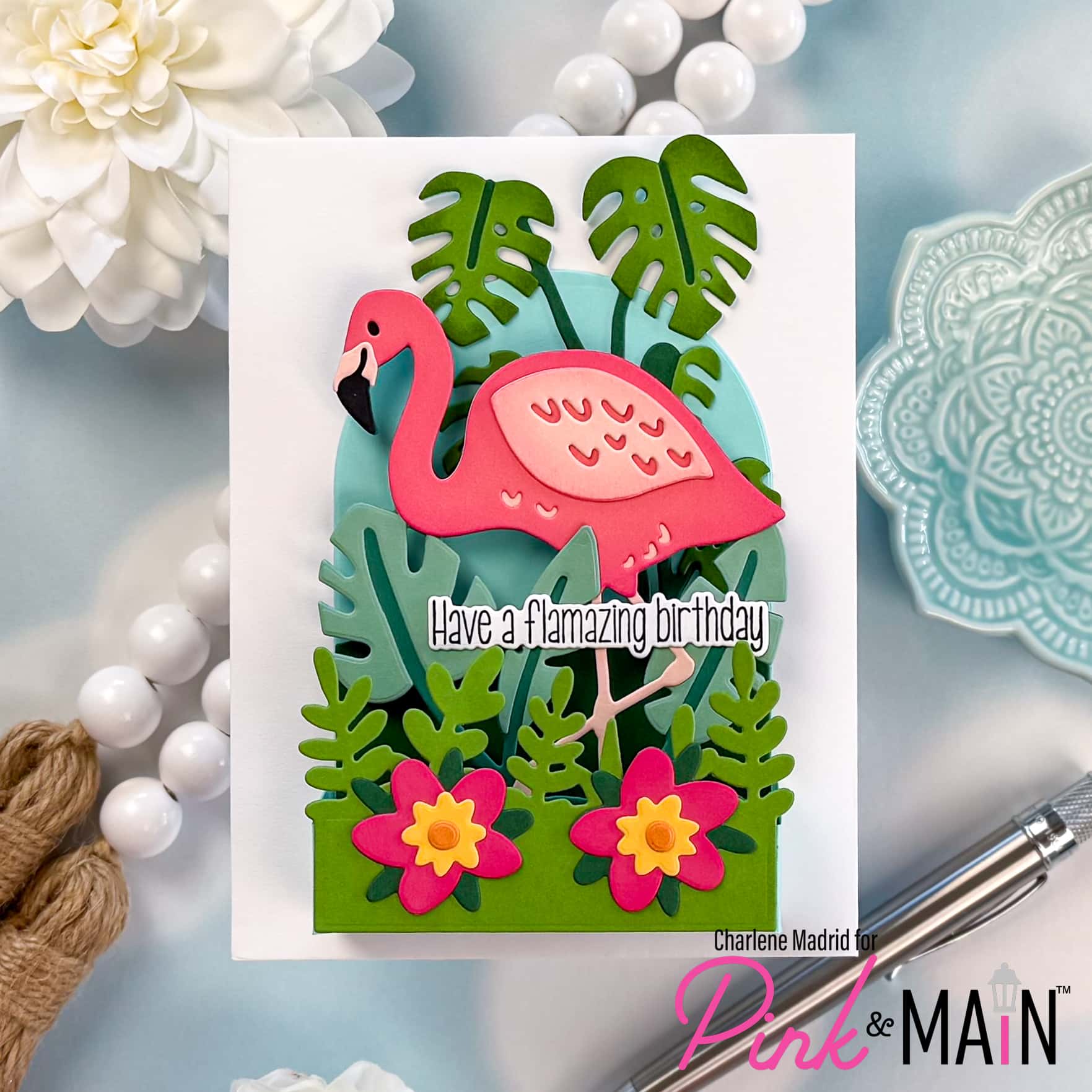
Have you ever looked at a die cut scene card and wondered why some feel full of depth while others fall a little flat? For this project, I used the Flamingo Pop Up Card Dies from Pink & Main to show how focal point, layering, color repetition, overlap, and scale can completely change the way your scene comes together.
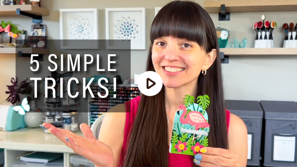
Watch the full video tutorial on YouTube
Click here for the full supply list
Disclosure
Compensated affiliate links may be used in this post at no cost to you. I received some of the products in this post at no cost. I will ONLY show you products from companies that I believe in and purchase from personally. Thank you for supporting me so that I can continue to bring you lots of fun crafting content!
In the video, you’ll learn:
- How to create a strong focal point with one bold image
- Why background, middle ground, and foreground layers matter
- How repeating colors creates balance across the card
- How overlap makes a die cut scene feel more realistic
- Why varying scale keeps your eye moving through the design
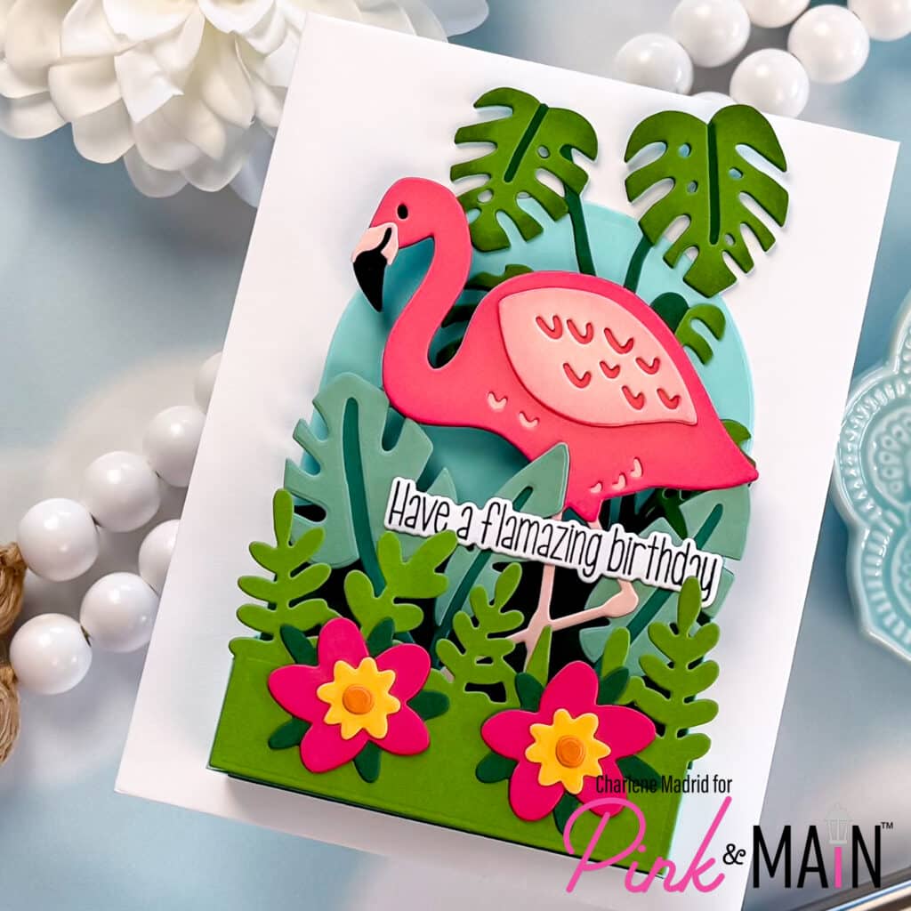
This card is such a fun reminder that strong scene cards are not about adding more and more pieces. They are about placing your pieces with intention. Create a focal point, think in layers, repeat your colors, overlap your elements, and vary the scale. Those five tricks will help almost any die cut scene feel more dimensional and finished.
Which scene-building trick do you use the most, color repetition, overlap, or scale?
Happy crafting, and I’ll see you in the next video!
Charlene
Supplies